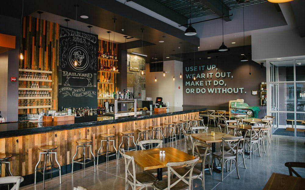
Located in the heart of Lincoln, Nebraska's historic railroad and Haymarket district, this new restaurant revives many regional dishes placing significance on a farm-to-table culinary (and design) philosophy. Jack and June, the restaurant’s namesake and original restaurateur's parents represent all of the Jacks and all of the Junes that consider their roots to be in the Midwest and embody a hardworking attitude, creativity, and dedication.
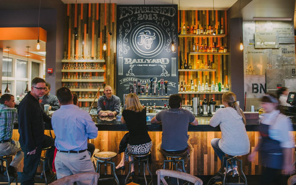
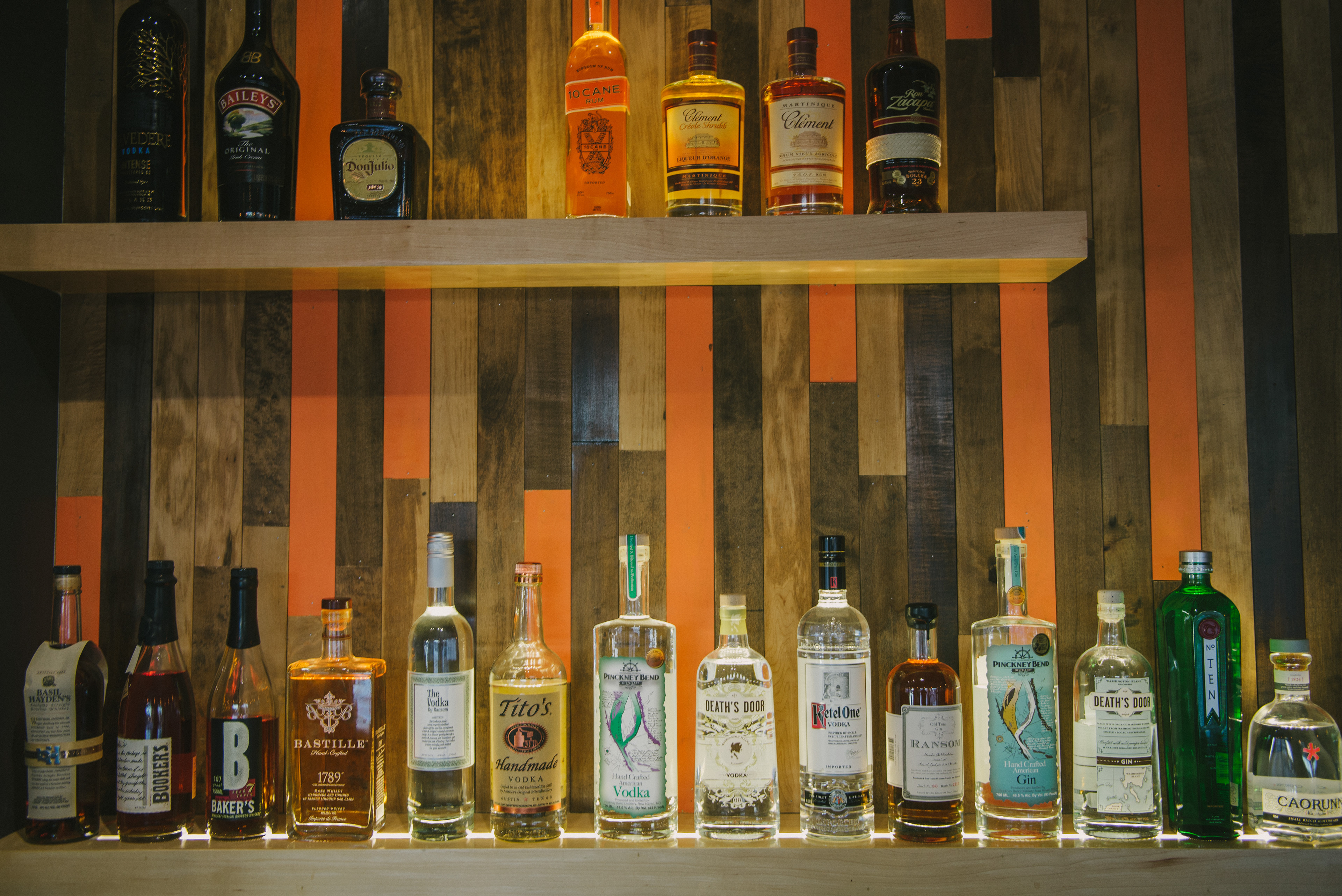
The brand is alive and full of topics to discuss. Subtle design elements enhance the story of Jack & June and inspire a resourcefulness for which Jack became well known. Rich colors and contrasting, unique materials extend the conversation beyond the present and take us back to our roots, near or far. Per tradition, we filled the restaurant with sustainable design elements that are rich in history and kind to our environment. From antique saltshakers to locomotives to gymnasium wood, we considered each element with respect to its environmental impact and its relevance to the brand.
The overall design celebrates the ingenuity of a past generation and welcomes a new one of environmentally conscious connoisseurs who appreciate excellent food and quality design.
Project Architect: BVH Architects
Brand Design: Archrival
We discovered a pile of old maple wood flooring in a local warehouse, and we knew it had to be integrated into the restaurant. Each piece was refinished to produce the desired range of finishes.
Each table was handmade from a local craftsman using locally sourced reclaimed wood we found in a nearby warehouse.
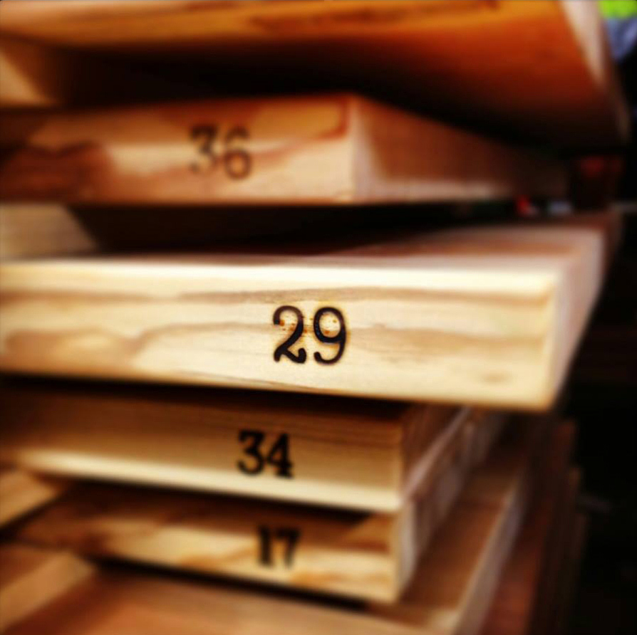
Photo: Kevin Shinn
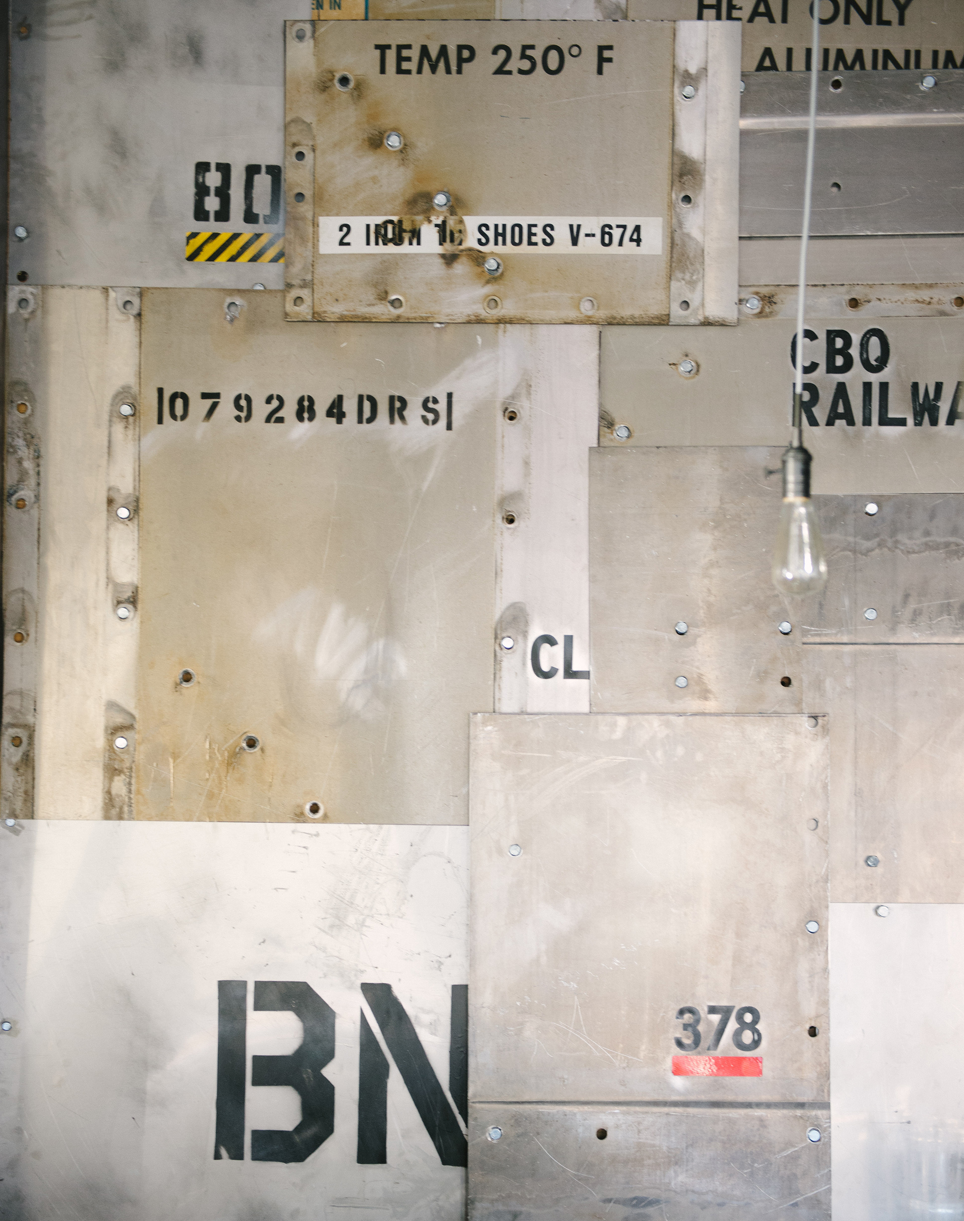
We worked with the local BNSF train company to divert some of their unusable scrap metal to our restaurant. The assorted scraps were cut into a collage that showcased the original markings and warnings that appeared on boxcars and locomotives which reminds guests of the railroad that once occupied the downtown Haymarket.
Jack was a tinkerer - he liked to make new things from old things. This quickly grew into the philosophy upon which we built the brand. It is revealed in the sustainable material selections throughout the restaurant. It was only appropriate to commemorate these words in the restaurant. The custom typeface was hand cut from pine to give it the authentic handmade aesthetic we desired.

This old truck we found became the first impression a guest experiences upon entering the restaurant. We chopped off the front end and made it the host station.